Category Archives: Pentaho

Pentaho Partner Summit

I’m at the Westin close to the event space for the summit…

I’m around tonight – meeting Bryan Senseman from OpenBI a bit later (730 or 800pm).  Anyone else around and want to meet up for dinner?  Email me ngoodman@ignorethispart.com bayontechnologies.com.

Make Mondrian Dumb

I had a customer recently who had very hierarchical data, with some complicated measures that didn’t aggregate up according to regular ole aggregation rules (sum, min, max, avg, count, distinct count). Now, one can do weighted averages using sql expressions in a Measure Expression these rules were complex and they also were dependent on the other dimension attributes. UGGGGH.

Come to that: their analysts had the pristine, blessed data sets calculated at different rollups (already aggregated to Company Regions). Mondrian though, is often too smart for it’s own good. If it has data in cache, and things it can roll up a measure to a higher level (Company Companies can be rolled up to Regions if it’s a SUM for instance) Mondrian will do that. This is desirable in like 99.9% of cases. Unless, you want to “solve” your cube and just tell Mondrian to read the data from your tables.

I started thinking – since their summary row counts are actually quite small.

  1. What if I could get Mondrian to ignore the cache and always ask the database for the result? I had never tried the “cache=” attribute of a Cube before (it defaults to true and I work with that 99.9% of the world). Seems like setting it to false does the trick. Members are read and cached but the cells aren’t.
  2. What if I could get Mondrian to look to my summary tables for the data instead of aggregating the base fact? That just seems like a standard aggregate table calculation. Configure an aggregate table so Mondrian will read the Company Regions set from the aggregate instead of the fact

Looks like I was getting close to what I wanted. Here’s the dataset I came up with to test:

mysql> select * from fact_base;
+----------+-----------+-----------+
| measure1 | dim_attr1 | dim_attr2 |
+----------+-----------+-----------+
| 1 | Parent | Child1 |
| 1 | Parent | Child2 |
+----------+-----------+-----------+
2 rows in set (0.00 sec)

mysql> select * from agg_fact_base;
+------------+----------+-----------+
| fact_count | measure1 | dim_attr1 |
+------------+----------+-----------+
| 2 | 10 | Parent |
+------------+----------+-----------+
1 row in set (0.03 sec)

mysql>
Here’s the Mondrian schema I came up with:

<Schema name=”Test”>
<Cube name=”TestCube” cache=”false” enabled=”true”>
<Table name=”fact_base”>
<AggName name=”agg_fact_base”>
<AggFactCount column=”fact_count”/>
<AggMeasure name=”[Measures].[Meas1]” column=”measure1″ />
<AggLevel name=”[Dim1].[Attr1]” column=”dim_attr1″ />
</AggName>
</Table>
<Dimension name=”Dim1″>
<Hierarchy hasAll=”true”>
<Level name=”Attr1″ column=”dim_attr1″/>
<Level name=”Attr2″ column=”dim_attr2″/>
</Hierarchy>
</Dimension>
<Measure name=”Meas1″ column=”measure1″ aggregator=”min”>
</Measure>
</Cube>
</Schema>

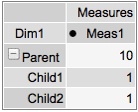
Notice that the aggregate for Parent in the agg table is “10” and the value if the children are summed would be “2.” 2 means it agged the base table = BAD. 10 means it used the summarized data = GOOD.

The key piece I wanted to very is that if I start with an MDX for the CHILDREN and THEN request the Parent will I get the correct value. Run a cold cache MDX to get the children values:

200902181235

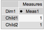
Those look good. Let’s grab the parent level now, and see what data we get:
200902181235-1

The result is 10 = GOOD! I played around with access methods to see if I could get if messed up and on my simple example it didn’t. I‘ll leave it to the comments to point out any potential issues with this approach but it appears as if setting cache=”false” and setting up your aggregate tables properly will cause Mondrian to be a dumb cell reader and simply select out the values you’ve already precomputed. Buyer Beware – you’d have to get REALLY REALLY good agg coverage to handle all the permutations of levels in your Cube. This could be rough – but it does work. 🙂 And caching – it always issues SQL so that might be an issue too.

Sample: cachetest.zip

Mondrian – you’ve been dumbed down! Take that!!!

Self Service Data Export using Pentaho

Every BI installation has power users that just want “data dumps.” They may need the dumps for a variety of reasons:

  • You’ve built crappy reports. They can’t get the information they need in *YOUR* reports.
  • They need to feed the data into another system. They want to select all customers who bought product X in time period Y to send them a recall notice. Need a dump of email / addresses to send them the notice.
  • They are addicted to Excel; they feel like a super hero whizzing through the data making fancy graphs and doing a few of their own ratios/calculations.
  • They want to munge the numbers. They will export it to Excel, throw out the data that makes them look bad, and then present it to their boss with shiny positive results.

I had a customer who needed something to “feed the data to another system.” Their original approach was to write a Pentaho Report that formatted to CSV well, write the parameterized query, and then simply generate the report and return it in the browser. This seems like a sound approach and would have been my first as well. They found that it did work well, to a point. It looked as if the Pentaho Report layer tends to use a bunch of memory for report generation – this is understandable. The report object is being rendered but is only “returned” to Pentaho when it’s complete. The entire dataset must be in memory. Well, needless to say, with this customers heap configuration they found a row threshold (30,000) that caused their Pentaho 1.6 installation to croak.

However, they didn’t really need to be using Pentaho Reporting. Kettle, which is included in Pentaho BI Suite has an straightforward performant way to export to CSV. If we could generate that file, and then simply return the file that we just generated to the browser we’d have an elegant solution for data export.

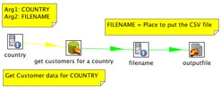
The first piece of the puzzle is the data export KTR. This KTR takes two arguments: Country and Filename. The Country is the value that will limit the data set that we are outputing (output customers in Italy). The Filename is the location to put the file. This isn’t necessary, but it allows the FILENAME to be set by the caller (.xaction) instead of callee (ktr). It’s for convenience.

200902090955

I’ve created a directory in tomcat/webapps/ named “lz”, short for landing zone. This /lz/ directory is accessible via the web browser. By placing this in this location we can use the same tomcat server that is hosting Pentaho to serve up our data export file as well.

Now, let’s get to a little bit of the magic of the Action Sequence, data_export.xaction.
200902091000

The first thing this action sequence does is to create a list of countries, and then prompt the user to select one. This is pretty standard stuff, done all the time with Pentaho reports so we won’t cover the specifics here.

Once we’ve got our “country” defined, we call our “Pentaho Data Integration” KTR component with two arguments. The first is the country the user has just selected and the second is the filename that we’ve hard coded as an input to our action sequence. The filename is the location on the local filesystem you would like kettle to generate the file at (ie, /apps/pentaho/tomcat/webapps/lz/data_export_file.csv).

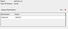
Once we’ve generated the file in that location, we’ll send a redirect to the user as the “output” of this action sequence. The user doesn’t really “see” this; the user will just see the .csv arrive in their browser. The way to get the redirect to work is to add the output to “response.redirect” like so:
200902091005
The redirect URI is another hard coded value: /lz/data_export_file.csv which should reference the path of the file on the web server.

The user experience is indistinguishable from standard reports. User is prompted:

200902091010

they click “OK” and are prompted what do do with their export.
200902091011

The performance of this solution far surpasses using Pentaho Reporting. Exports of 10,000 rows that were taking 30-60 seconds were taking 10-15 seconds. However, be warned. The export via Kettle will only have as many formatting options as are present in the “Text File Output” step which are many, but limited. If you need fine control over the format of your data export, you may have to stick with Pentaho Reporting since it does provide a superior set of layout/formatting controls.
It should also be noted that this works with zipped files (to zip up the .csv), and also .XLS exports. I’ve provided this sample (data_export.zip) that works with Pentaho 2.0 BI (Needs hypersonic sample database). You’ll have to adjust the “filename” variable to your filesystem before running it for it to work properly (it has the location of my installation).

The death of prevRow = row.clone()

UPDATE: This step is available in Kettle 3.2 M1.

For those that have done more involved Kettle projects you’ll know how valuable the Javascript step is. It’s the Swiss Army knife of Kettle development. The calculator step is a nice thought, but the limited set of functions and the constriction of having to enter it in pulldowns can make more complex calculations more difficult.

Those that have done “observed metric” type calculations in Kettle will know this bit of Javascript well:

var prevRow;
var PREV_ORDER_DATE;

if ( prevRow != null && prevRow.getInteger(“customernumber”, -1) == customernumber.getInteger() )
PREV_ORDER_DATE = prevRow.getDate(“orderdate”, null);
else
PREV_ORDER_DATE = null;

prevRow = row.Clone();

This little bit of Javascript allowed you to “look forward” (or back depending on your sorting) and calculate the difference between items:

  • Watching a set of “balances” fly by and calculate the transactions (this balance – prev balance) = transaction amount
    Web Page duration (next click time – this click time) = time spent viewing this web page
    Order Status time (next order status time – this order status time) = Amount of time spent in this order status (warehouse waiting)

In other words, lining data up and peaking ahead and backwards is a common analytic calculation. In Oracle/ANSI SQL, there’s a whole set of functions that perform these type of functions.

This week I committed to the Kettle 3.2x source code a step to perform the LEAD/LAG functions that I’ve had to hand write several times in Javascript. It’s been long overdue as I told Matt I designed the step in my head two years ago and he’s been patiently waiting for me to get off my *ss and do something about it.

You can find more information about the step on its Wiki page, along with a few examples in the samples/transformations/ directory.

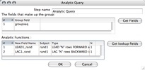
The step allows you peek N rows forward, and N rows backward over a group and grab the value and include it in the current row. The step allows you to set the group (at which to reset the LEAD/LAG), and setup each function (Name, Subject, Type, N rows)
200901301239
Using a group field (groupseq) and LEADing/LAGing ONE row (N = 1) we can get the following dataset:
200901301238
Any additional calculations (such as the difference, etc) can be calculated like any other fields.

This was my first commit to the Kettle project, and a very cool thing happened. I checked in the base step and in true open source fashion, Samatar (another dev) noticed, and created an icon for my step which was great since I had no idea what to make as the icon. Additionally, hours after my first commit he had included a French translation for the step. He and I didn’t discuss it ahead of time, or even know each other. That’s the way open source works… well. 🙂

RIP prevRow = row.clone(). You are dead to me now. Long live the Analytic Query step

Happy New Year 2009!

I resisted the urge to post a “2008 recap” and “2009 predictions” since that seemed to be well covered in lots of different circles/blogs.

Ahhh… Who am I kidding? I’m just lazy! 2008 was a crappy year (personally, but not professionally) and 2009 is off to a great start (personally, but not professionally)!

Already I’m very much enjoying 2009 even though the consulting work is shaping up pretty light these first few weeks.

<shamelessplug>
Need any help with Mondrian/Kettle/Pentaho? I’m available for smaller 3-20 day engagements remotely and onsite in North America.
</shamelessplug>

The best part about the start of the year, was I was able to get some time testing, updating, and deploying to my demo server the two projects that Bayon has been sponsoring over the past few months.

JDBCKettle – Allows for Kettle transformations to be used in an EII fashion. This allows you to use a (set of) kettle transformations and access via SQL.

PentahoFlashCharts – Updated to OFC 2.0 and Pentaho 2.0.stable it also includes new XML Template for building charts. Right now it’s diverged from the Pentaho chart standard but I hope to get back to the standard pentaho chart definition before this goes to an initial Beta release.

I’ll be blogging more about these projects in the coming days.

Happy New Year!

Hidden little trend arrows

Many readers of this blog use JPivot. The solidly average web based Pivot Viewer that I’ve heard described as a “relic” of the cold war – no frills utility software. However, as maligned as JPivot is, it does have some great features and has been production quality software for years now. One of these hidden little features that is in JPivot (and also in Pentaho) is the quick and easy way to add trend lines to a JPivot screen by simply using MDX.

Consider, for instance, this little bit of MDX:

with member [Measures].[Variance Percent] as ‘([Measures].[Variance] / [Measures].[Budget])’, format_string = IIf(((([Measures].[Variance] / [Measures].[Budget]) * 100.0) > 2.0), “|#.00%|arrow=’up’“, IIf(((([Measures].[Variance] / [Measures].[Budget]) * 100.0) < 0.0), “|#.00%|arrow=’down’“, “#.00%”))
select NON EMPTY {[Measures].[Actual], [Measures].[Budget], [Measures].[Variance], [Measures].[Variance Percent]} ON COLUMNS,
NON EMPTY Hierarchize(Union({[Positions].[All Positions]}, [Positions].[All Positions].Children)) ON ROWS
from [Quadrant Analysis]

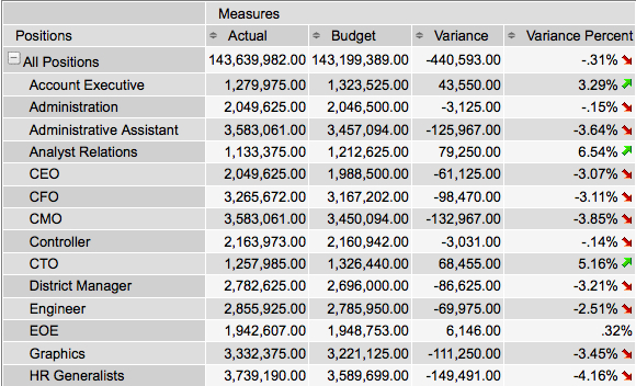
which produces this lovely set of arrows letting the user know how their individual variance value rates in terms of KPI thresholds.

200811111457

The secret of course, is the arrow= tag in the format string. Easy enough. “up” is a green up arrow. “down” is a little red arrow. “none” is no arrow.

Happy Visual Cue Indicator day to you all.

How to Disable Drill Through on Pentaho Charts

I have some dashboard pages which show charts that are purely informational. They don’t need to click to anywhere. In fact, since I’m loading these charts via AJAX calls I do not want them to be linked. I want them to be images without any URLs and no clicks.

200810031517
All of those bars / lines etc I just want to have hovers (to see the values, but no click through locations).

However, after looking through all the documentation and code for it, I couldn’t find a single way to suppress the generation of hyperlinks for the charts. Sure, I could get the image from the ChartComponent but then I wouldn’t get the hover values. Until it occurred to me. Why not just make a URL link that does nothing?

Adding the following fragment to the chart definition can make the link, in essence, do nothing and not even refresh the page. Meets my needs.

<use-base-url>false</use-base-url>
<url-template>javascript:;</url-template>

Not ideal though. It still shows the user a clickable area so the user may think the application isn’t working properly. I think BISERVER-2222 will be better in the long term but a stop gap measure that helps my customers for sure.

It is FINALLY here – Manage Datasources

Since the very first time I downloaded the Pentaho suite I’ve been wailing, screaming, shouting, snarking that there absolutely MUST be a way to manage data sources that does not involve XML.

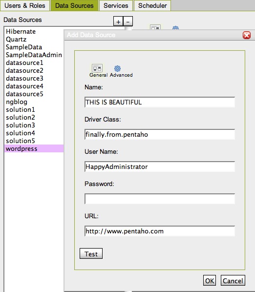
Well… Holy Shit. At just under 3 years it’s here (Pentaho Administration Console from 2.0.M3 build):

200810011933

This is a most appreciated feature for those getting started with Pentaho! Thank you to the Pentaho Engineers for whipping it up!
PS – It’s not perfect yet, but should be solid by 2.0 GA

Business Intelligence: Experience vs Sexy

A couple of postings over the past few days that prompted me to put some digital pen to paper so to speak. The first was a post by L. Wayne Johnson who works for Pentaho who I had the pleasure to meet last week in Orlando entitled “Is it just sexy?” The second was by a Ted Cuzzillo over at datadoodle.com entitled “Tableau is the new Mac” Both share important perspectives that deserve some more light.

First, we have to start with a premise that leads you to see why there are two somewhat divergent paths that products/people/companies are taking. BI is now a commodity. The base technology components for doing BI (reports, dashboards, OLAP, ETL, scheduling, etc) is commodotized. Someone once told me that once Microsoft enters and nails a market, you know it’s been commodotized and based on the success of MSAS/DTS/etc you can tell that MSFT entered long ago and nailed it. So, if you don’t believe that the raw technology for turnings data into information is essentially commodotized then you should stop reading now. The rest will be useless to you.

What happens when software becomes a commodity? There’s usually a mid market but you start to see players emerge at two ends of a spectrum.

Commodity End (Windows, Open Office, linux, Crystal Reports):

  • Hit the good side of the features curve. Definitely stay on the good side of the 80/20 rule.
  • Focus on lots and lots of basic features. You’re trying to appeal to lots and lots of people. If you’re pipe isn’t 1000x bigger than the other market you are toast.
  • Provide a “reasonable” quality product. To use a car metaphor, you build an automatic transmission car with manual windows. The lever to open and close the window doesn’t usually fall off and if it does, you’ve already put 100,000 miles on the car.
  • Treat the user experience as one category in “Features.” Usability is something you build so that customers don’t choose the other guy over you – it’s not core to your business, you just have to provide enough for them to be successful and not hate your product.
  • Sell a LOT of software. Commodity End of a market is about HIGH VOLUME (you should sell at least one or two orders of magnitude more than the experience end) – however, people looking for “reasonable commodity” products are cheap. They want low prices so this also means your MARGINs are lower. Commodity selling is about HIGH VOLUME, LOW MARGIN business. (Caveat: not always true).

Experienced Based (Mac, iPhone, Crystal XCelcius):

  • The good side of the 80/20 rule still applies. Experience based doesn’t always mean 100% high end, every bell and whistle.
  • Focus on features that matter to the user doing a job. If a feature is needed to help a customer nail a part of their using your product it, add it and make it better than they expect. Lacking features isn’t a bad thing if you keep adding them – for instance the iPhone was LAME feature for feature initially (no GPS, battery was a pain, etc) but users were patient.
  • Provide a high quality product that is as much about using as doing. The experienced based product says that it’s not enough to have a product that does what you want, but it has to be something you ENJOY using.
  • User and Experience is KING. Usability is not something that is a feature to implement, it’s the thing that informs, prioritizes and determines what features are implemented.
  • Sell some software. In order to get the driving experience a user wants (BMW 700x series) they are willing to pay for it. It’s a higher margin business and there’s no secret that if someone is looking for something that both works, and they LOVE to use then it’s worth more to them. It’s a LOWER VOLUME, HIGHER MARGIN business. (Caveat: not always true – things are relative. iPod is higher margin but also high volume).

So… Let’s get back to the point on BI. I’ve built some sexy BI dashboards for customers that look great, including some recent ones based on the Open Flash Chart library. However, I come more from the Data Warehouse side of the house so more of my time is spent on ETL, incremental fact table loads, etc. I understand that you have to have a base of function/feature to have a fighting chance on the experience side.

Sexy isn’t “just sexy” if done right. When done right, Sexy is called “Great Experience.”

Experience is about creating something that people want to use. People are happier with a software product when they enjoy using it. For instance, Ted refers to Tableau as “a radically new product.” I’ve seen it and it’s a GREAT experience, with some GREAT visualization but there’s nothing REVOLUTIONARY about it except for the experience. It’s not in the cloud, it’s not scaling beyond the petabytes, it’s not even a web product (it’s a windows desktop APP). Not revolutionary, just GREAT to use.

Tableau is an up and comer for taking something commoditized (software to turn data into insight) and making it fun to use and leaving users with a desire for more. Kudos to Tableau.

What about on the commodity side – that’s where players like Pentaho come in. They’ve built something that meets a TON of needs for a TON of customers and does so at a VERY VERY compelling price (free on open source side, or subscription for companies). Recall, Pentaho is the software that I use day in and day out to help customers be successful – and they are consistently. Pentaho is earnestly improving their usability that matches up with the philosophy of Usability is a category of features. Sexy is just Sexy for the kind of business and market they are trying to build. They want to make things look nice to be usable and help people do their job well but they’re not going to spend man years on whizbang flash charts. The commodity end is a great business model – Amazon.com is pointed about their business model of “pursuing opportunities with high volume and low margins and succeeding on operational excellence.” I consider Pentaho a bit more revolutionary than Tableau – it’s 100% platform independent and the rate at which open source development clips IS REVOLUTIONARY.

Pentaho is an up and comer for taking something commoditized (software to turn data into insight) and making it easy to obtain, inexpensive to purchase, and feature rich. Kudos to Pentaho.

Both sides of the market are valid. There’s a Dell and an Apple. There’s BMW and Hyundai – both are equally important to the markets they serve and the same is true for BI as a market.

PS – I do agree with L. Wayne Johnson that there can be sexy that is “just sexy.” A whizbang flash dial behind questionable data is pretty lame, or an animation that adds nothing to the data (see this Flash pie chart for an example of a useless sexy animation) The point being that if you consider the “antee” for the BI game at “good data” then the experience/feature sets/approach is what separates the market.
Ordered Rows in Kettle

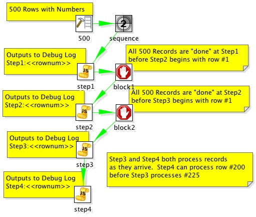
There was a question posed the other day on the Pentaho forums about how to get Kettle to process “all the rows” at one step before beginning execution on the others. Sven suggested to use the “execute once for every row” as a solution which I think is probably overall, a cleaner way to accomplish a multistep process. However, it is possible to do this in Kettle now.

The solution is to add “Blocking Step”s in your transformation where you need the whole thing to have completed before continuing processing.

Consider the following example:

200806251534

The step “block1” does not pass rows to Step2 until all rows have finished at Step1. This accomplishes the desired outcome of ensuring that all records have completed processing on step1 before step2 processes. The example transformation outputs to the debug log and it’s clear that they are output in the correct order.

2008/06/25 15:25:04 - step1.0 - Step1:1
2008/06/25 15:25:04 - step1.0 - Step1:2
2008/06/25 15:25:04 - step1.0 - Step1:3
2008/06/25 15:25:04 - step1.0 - Step1:4
2008/06/25 15:25:04 - step1.0 - Step1:5
...
2008/06/25 15:25:05 - step1.0 - Step1:499
2008/06/25 15:25:05 - step1.0 - Step1:500
...
2008/06/25 15:25:05 - step2.0 - Step2:1
2008/06/25 15:25:05 - step2.0 - Step2:2
2008/06/25 15:25:05 - step2.0 - Step2:3
2008/06/25 15:25:05 - step2.0 - Step2:4
2008/06/25 15:25:05 - step2.0 - Step2:5
...
2008/06/25 15:25:05 - step2.0 - Step2:499
2008/06/25 15:25:05 - step2.0 - Step2:500
...
2008/06/25 15:25:05 - step3.0 - Step3:1
2008/06/25 15:25:05 - step3.0 - Step3:2
2008/06/25 15:25:05 - step3.0 - Step3:3
2008/06/25 15:25:05 - step3.0 - Step3:4
2008/06/25 15:25:05 - step3.0 - Step3:5
2008/06/25 15:25:05 - step3.0 - Step3:6
2008/06/25 15:25:05 - step3.0 - Step3:7
2008/06/25 15:25:05 - step4.0 - Step4:1
2008/06/25 15:25:05 - step3.0 - Step3:8
2008/06/25 15:25:05 - step4.0 - Step4:2
2008/06/25 15:25:05 - step3.0 - Step3:9
2008/06/25 15:25:05 - step4.0 - Step4:3
2008/06/25 15:25:05 - step4.0 - Step4:4

Example here: ordered_rows_example.ktr